A lot of work and late nights went into this to get it where I wanted it, but in the end it was all worth it! The process was somewhat lengthy and strenuous, especially initial research for inspiration and image collection. However, other aspects that usually take me longer (such as the custom lettering) happened a lot faster and smoother than I expected.The type itself only went through minor revisions from the original sketch, as you can see below. The only other part of the process that was difficult was color choice. I didn't document the color selection process here, but this poster went through somewhere around 25 color revisions. The darker palette in the final version really seemed to reinforce what I was trying to do with the collage imagery without being too "girly" (I really felt the lettering was girly enough, so I veered away from pinks, reds, and purples). Highlights were applied last, which I think really pulled everything together, remixing the vintage hand drawn illustration with a digital element. Juxtaposition folks!

Final Poster design, illustration + custom lettering

This is the Initial lettering sketch. The final logotype didn't deviate much from this sketch.

I composed the collage in Illustrator with found vintage art and then re-drew the entire poster with a Tombow brush marker.
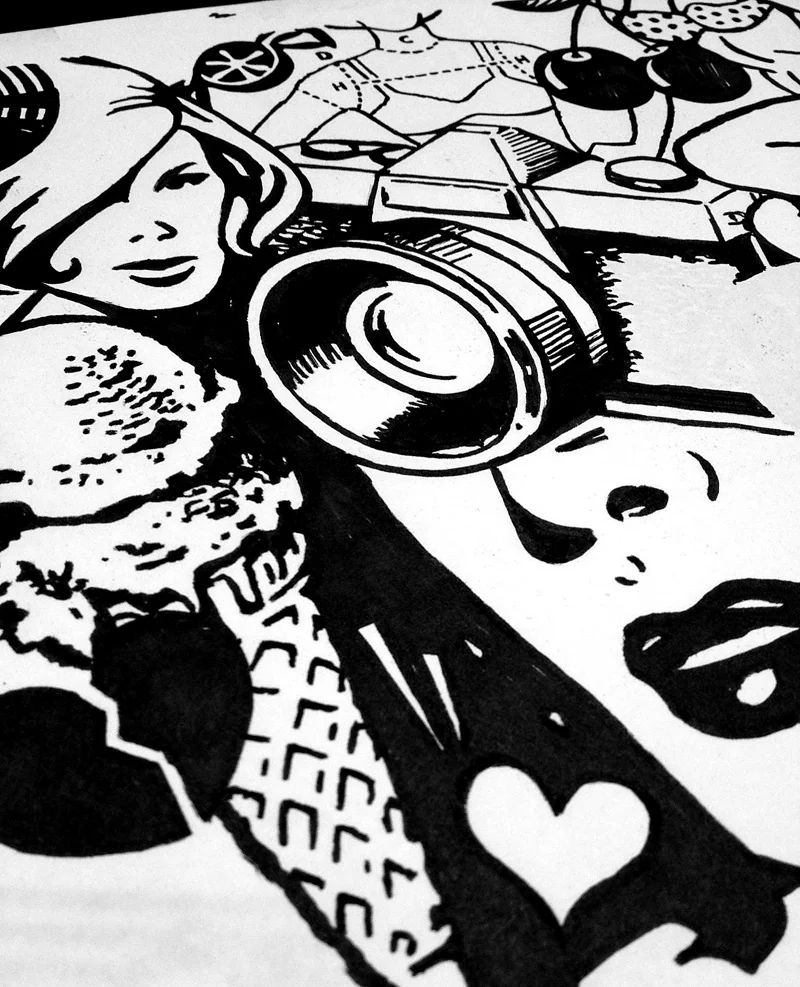
Ice cream! Cameras!
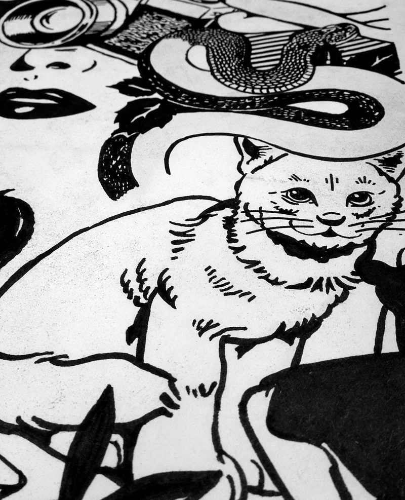
Kittens!

and Snakes! This was the last stretch of tracing the image.

and Snakes! This was the last stretch of tracing the image.